BRAND IDENTITY DESIGNER
My work lives in the space where imagination becomes tangible, design carries meaning forward, and motion brings stories to life. I create brands that linger in the memory and live with purpose.
Collected Works
Campesino Rum
BRANDING • CREATIVE DIRECTION • DESIGN
A rum brand as bold as the spirit itself—inviting the world to “Drink in the Wild.”
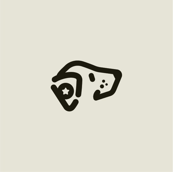
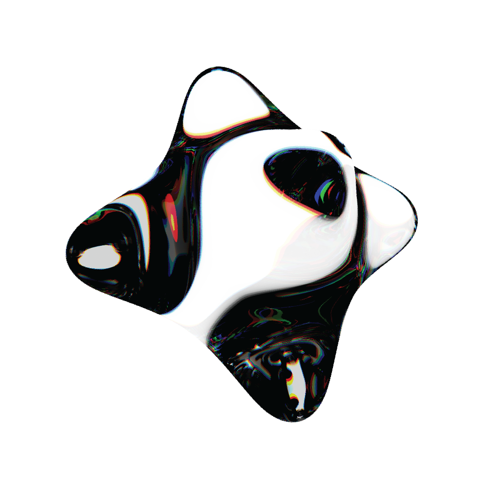
Inspired by founder Hatton’s time living among Panamanian Campesinos, the identity captures a raw, elemental spirit shaped by the untamed jungle and its stories. A broken ouroboros and the jaguar—symbols of transformation, strength, and passage into another realm—form a visual language that feels both primal and intentional, expressed through confident stencil typography and an unrefined sense of origin.


-
A rum brand as bold as the spirit itself—inviting the world to “Drink in the Wild.”
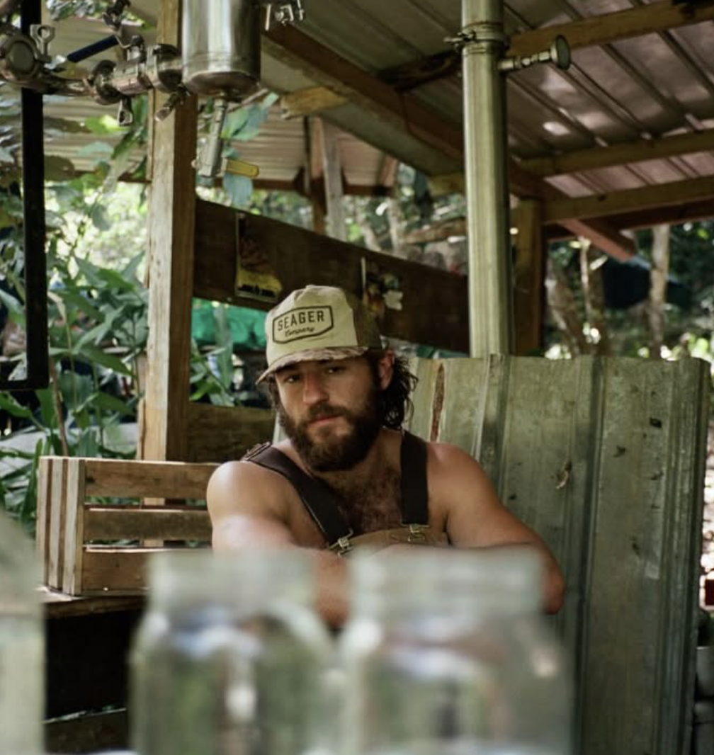
The identity draws from founder Hatton’s time living in the Panamanian jungle, where he learned the craft of rum-making alongside local Campesinos. The direction embraces a raw, elemental quality shaped by the textures and stories of the environment. I imagined rum distilled deep in the wilderness and shipped home in simple wooden crates, boldly stamped Campesino—an unrefined confidence that informed both the stencil typography and primary mark.
The ouroboros, traditionally a symbol of renewal and the cycle of life, was reinterpreted as a broken infinity form—suggesting passage into another realm and the idea of transformation through experience. This became the defining symbol for Campesino Silver. The animal language was inspired directly by Hatton’s encounters with the jungle’s wildlife, most notably the jaguar, revered as ruler of the night and a symbol of ferocity, valor, strength, and power. Together, these elements create a brand grounded in the mystique, intensity, and spirit of the wild.
Southern Research
REBRAND • CREATIVE DIRECTION • DESIGN
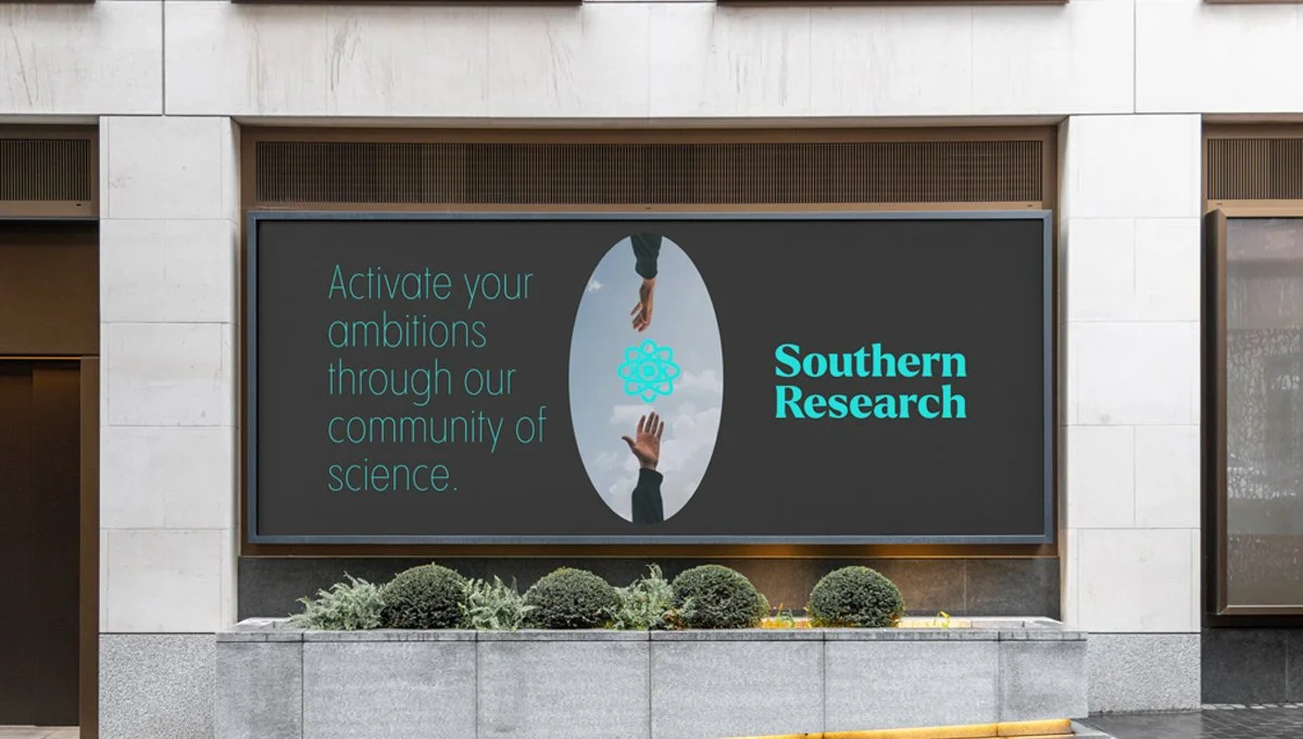
Activating ambitions through a community of science.
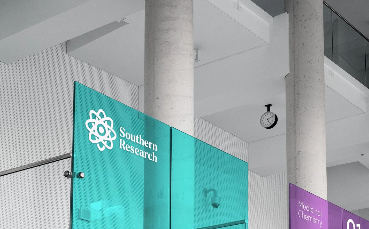
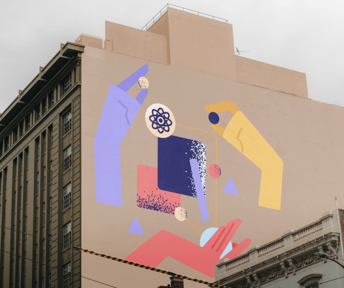
The Southern Research identity expresses Creative Precision—the balance of imagination and rigor that transforms ideas into real-world impact. Inspired by the atom and composed of the eye, spark, and nucleus, the mark reflects curiosity, discovery, and momentum, while elemental color and living textures evoke the moment just before breakthrough—when possibility sharpens into clarity.
-
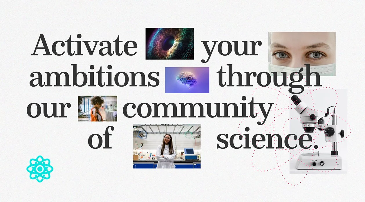
Activate your ambitions through the community of science.
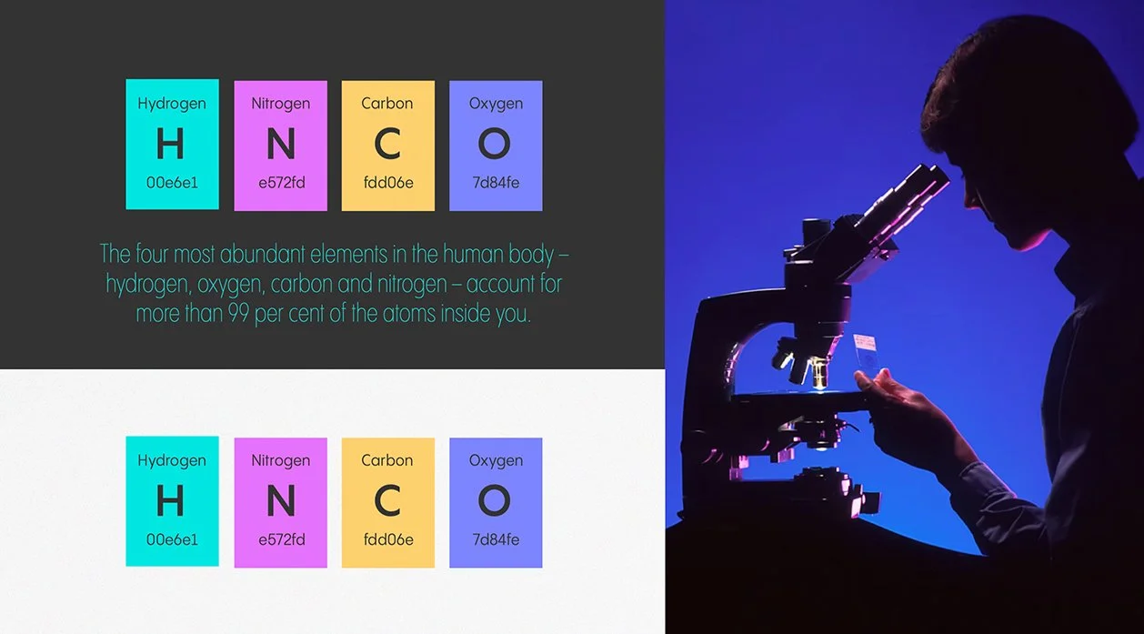
The identity for Southern Research reflects a spirit that is focused, vibrant, and deeply human—capturing the energy required to move ideas from possibility into practice. Rooted in the brand strategy Spark Solutions, the mark embodies Creative Precision: the balance of imagination and rigor that allows discovery to become real-world impact. Inspired by the atom, the symbol separates into three essential parts—the eye, the atom, and the spark—representing curiosity, knowledge, and the catalytic moment that moves science forward.
Color draws from the four most abundant elements in the human body—hydrogen, oxygen, carbon, and nitrogen—reinforcing the connection between research and the lives it ultimately serves. Granular textures, color mesh gradients, and blurred forms evoke millions of particles converging, forming an organic visual field that feels active and alive. The softened focus references the view through a microscope just before clarity comes into alignment—the moment just before discovery. Together, these elements create a flexible visual system designed to evolve across mediums, supporting a mission centered on turning uncharted potential into meaningful progress and long-term impact.
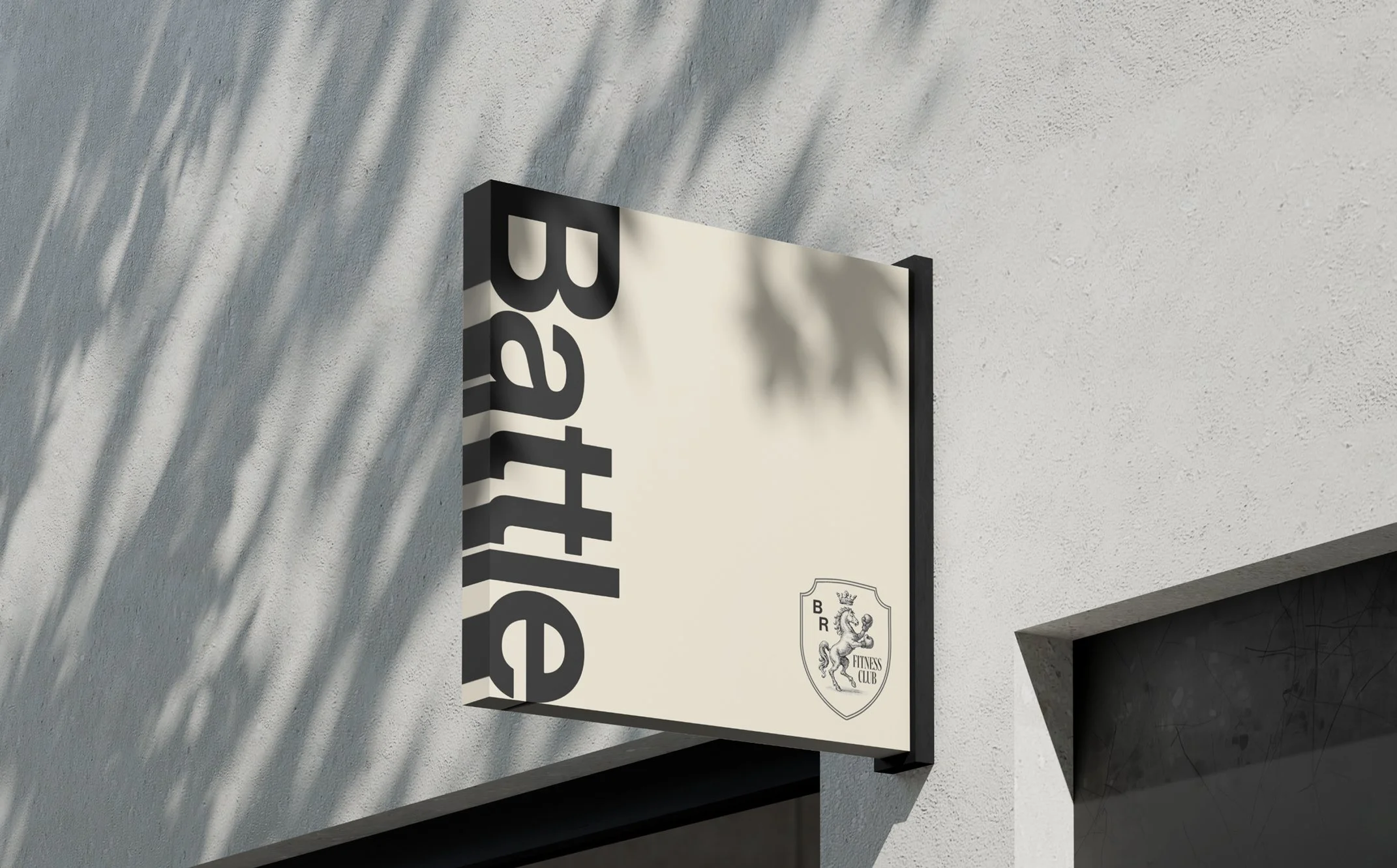
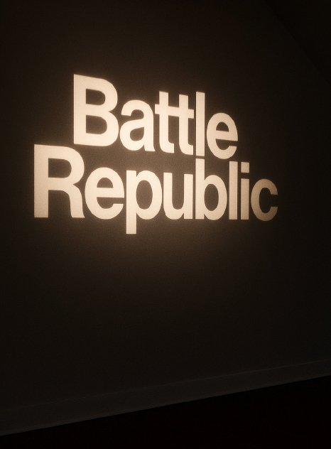
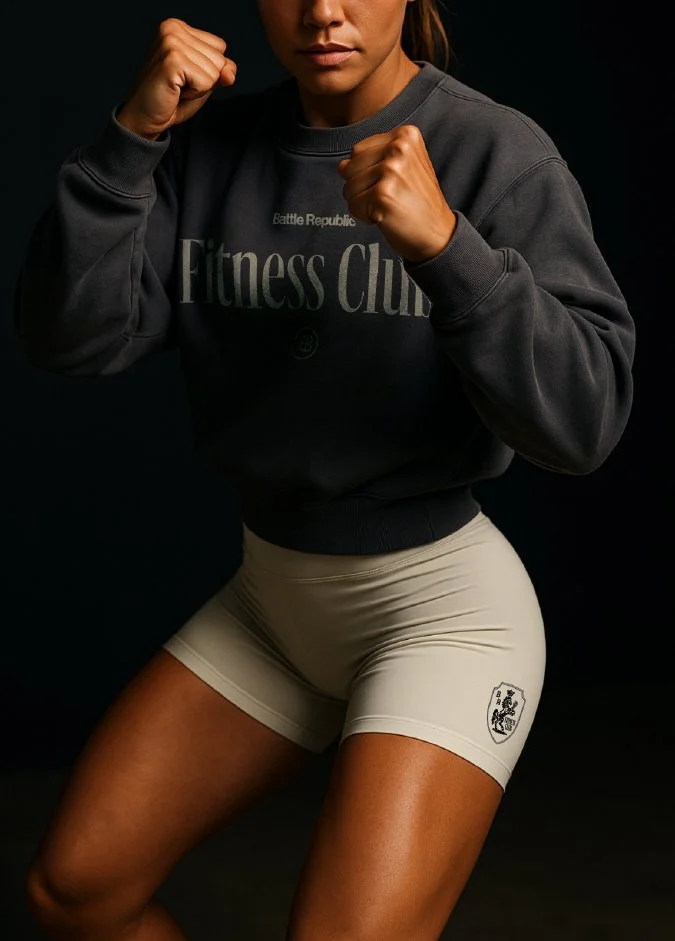
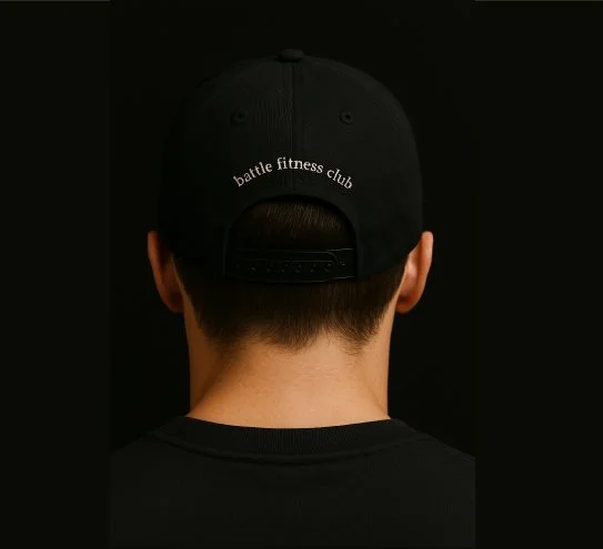
Battle Republic
REBRAND • CREATIVE DIRECTION • DESIGN
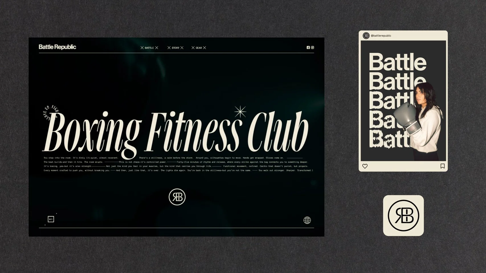
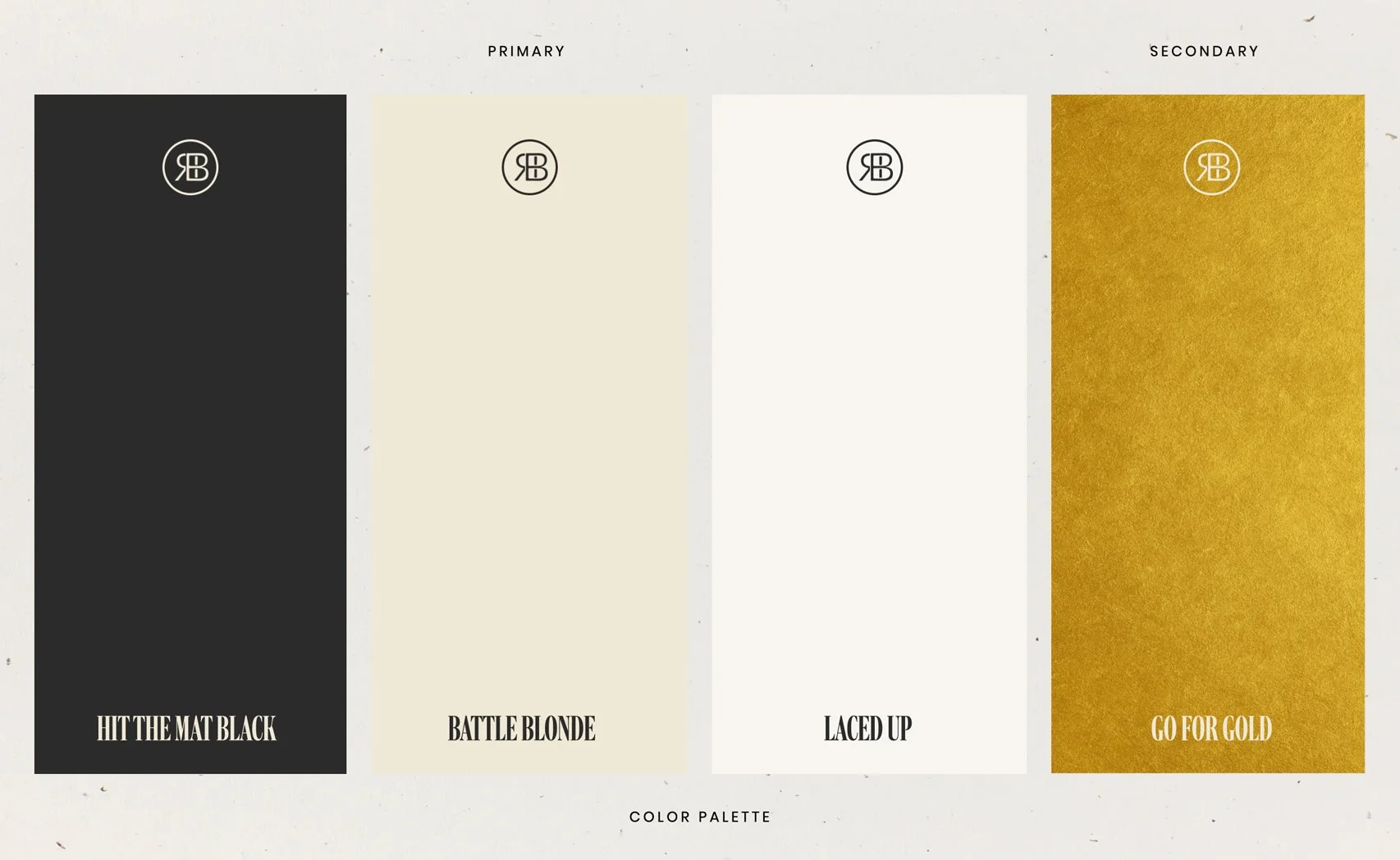
Battle Republic blends the grit of boxing culture with a refined, modern sensibility—creating a space where discipline strengthens both body and mindset. A minimal monochrome palette, balanced typography, and a flexible system of submarks support a brand that feels strong, confident, and built to evolve across training and merchandise.
Clean. Elevated. Approachable.
-
Clean. Elevated. Approachable.
Battle Republic was designed as a modern training space where grit meets refinement—balancing the intensity of boxing culture with a sense of clarity and composure. The identity embraces minimalism with intention, creating an atmosphere that feels both disciplined and welcoming to seasoned athletes and newcomers alike. It’s where luxury fitness meets the raw energy of a boxing club, supporting the belief that the battles we fight physically strengthen the resilience we build mentally.
A system of submarks and supporting graphics extends the brand across a steady cadence of merchandise drops, allowing the identity to live fluidly beyond the studio. The palette remains intentionally restrained, built from nuanced blacks, blondes, creams, and a refined gold accent that introduces quiet confidence without excess. Typography balances strength and sophistication through the pairing of a bold serif and clean sans serif—structured yet approachable. Together, these elements create a brand that elevates both body and mindset, offering a space that reminds people they were made for more.
Alabama Beer Co.
BRANDING • CREATIVE DIRECTION • DESIGN
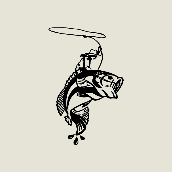
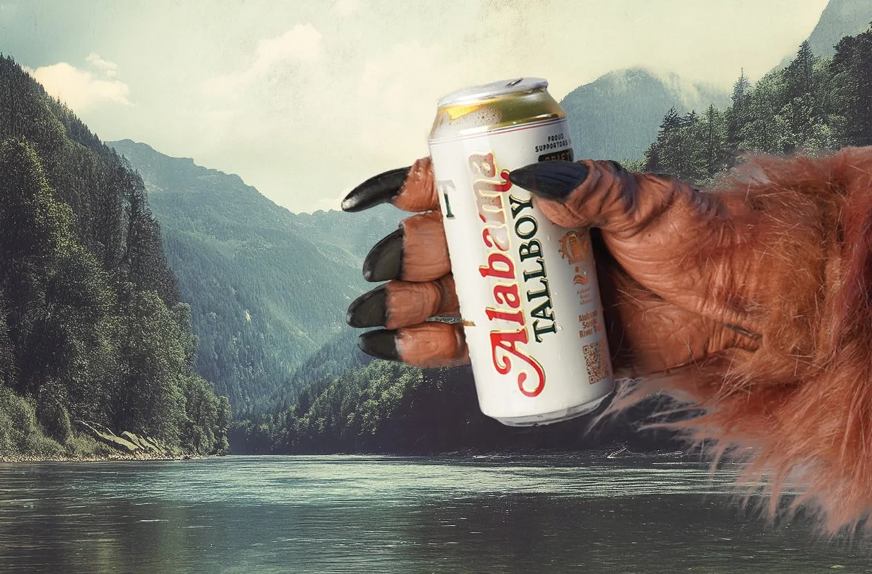
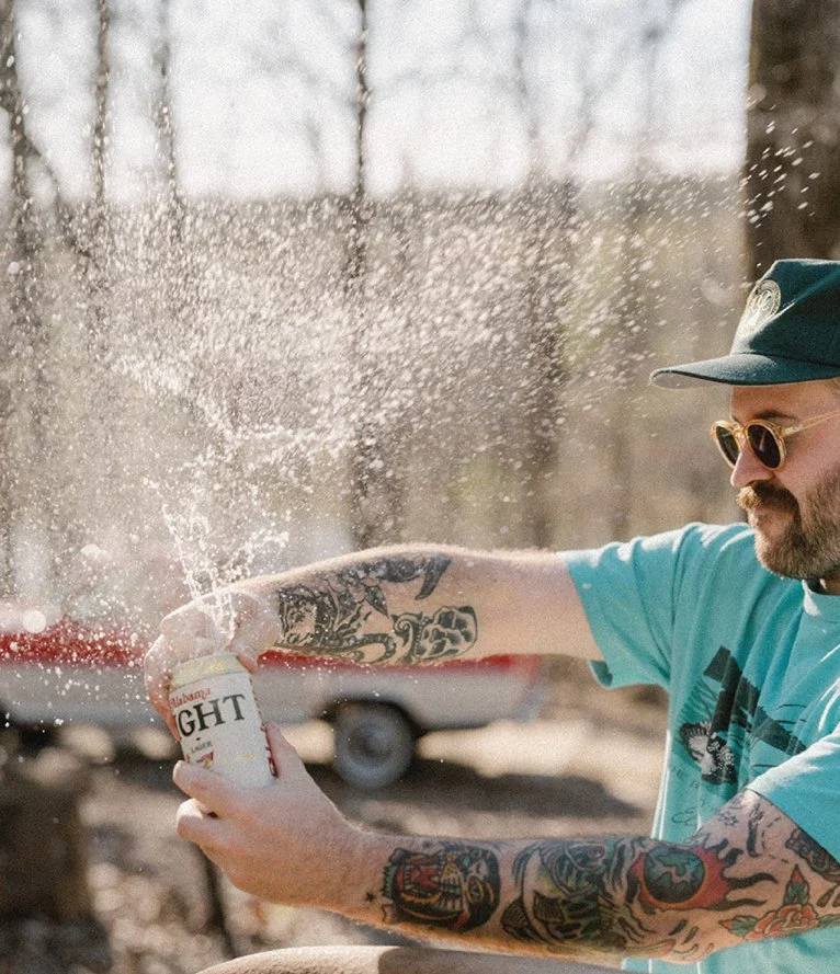
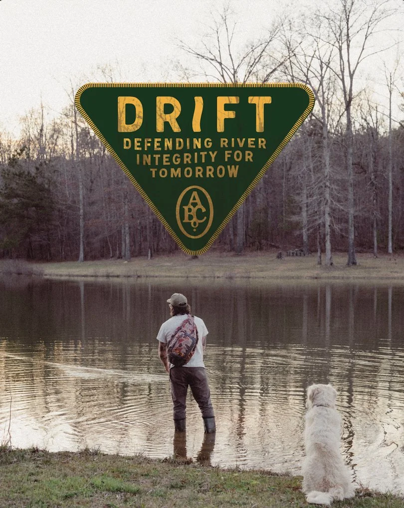
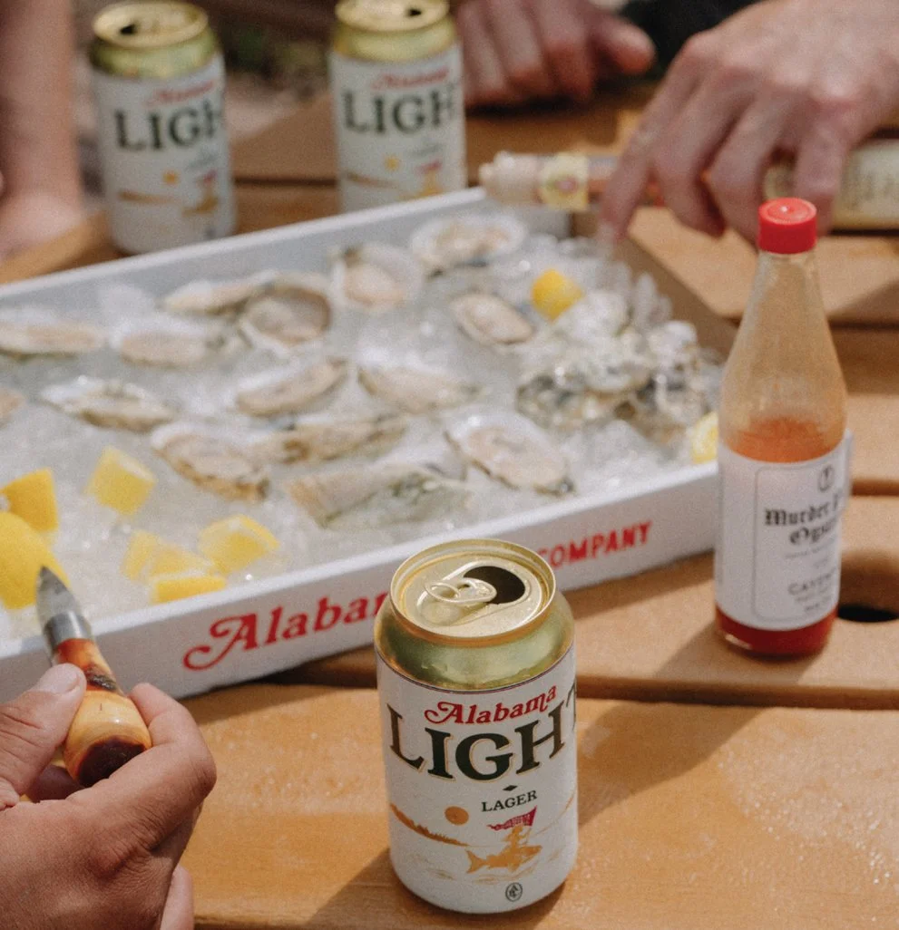
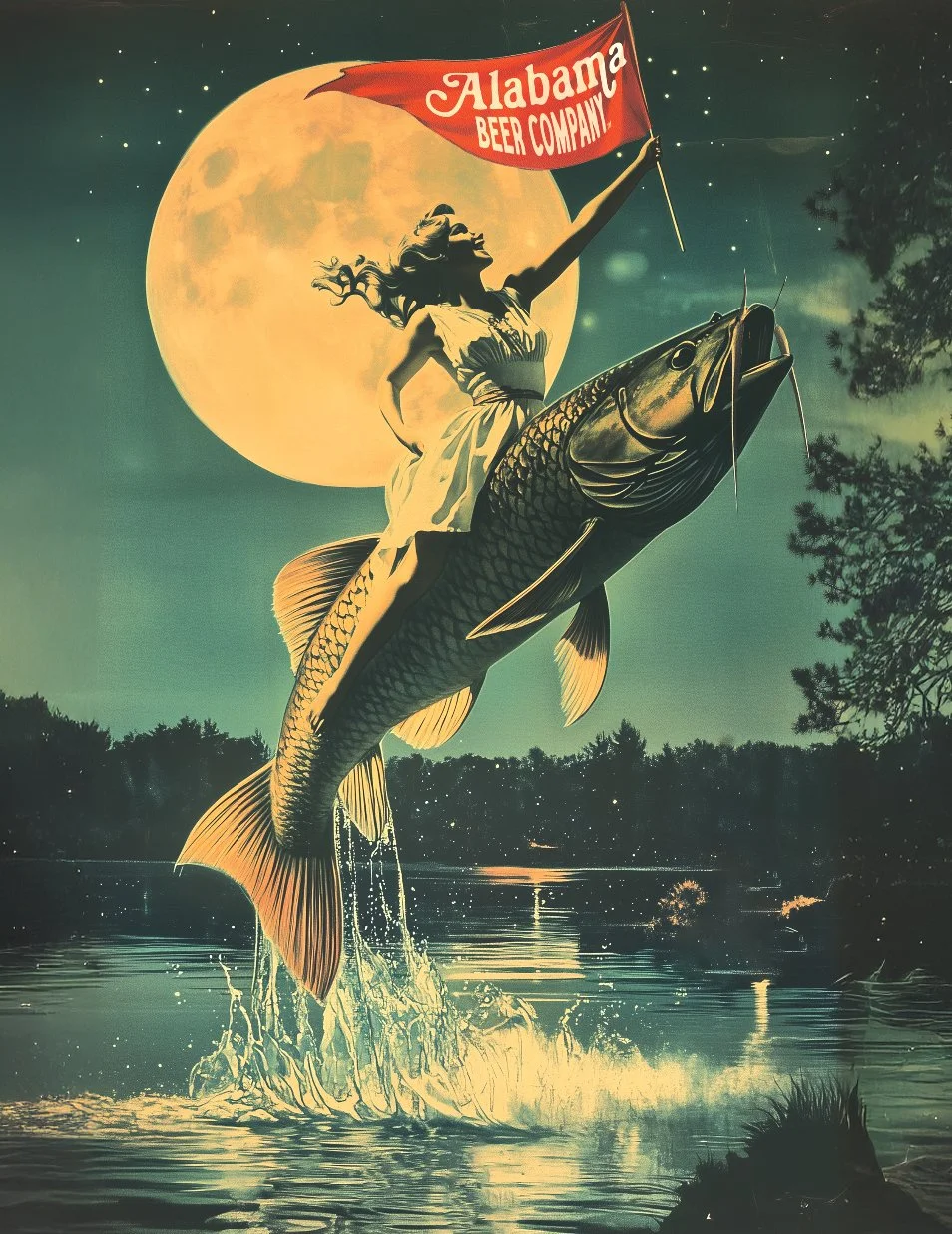
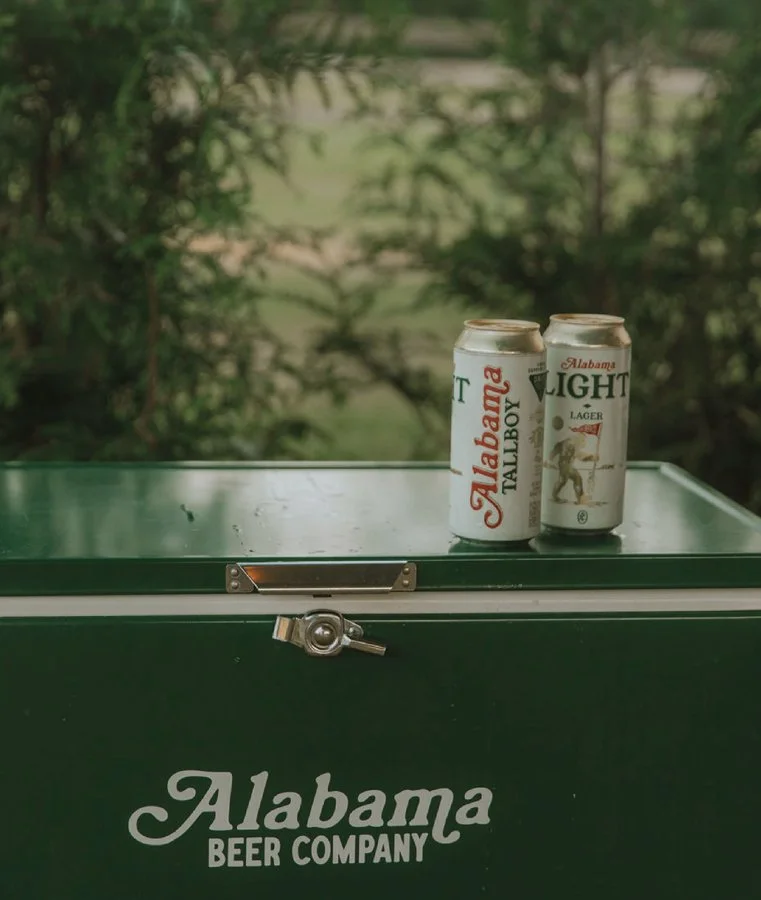
Light beer done right. Alabama Beer Co. was founded on the idea that simplicity, executed with care, creates something lasting—resulting in Alabama Light, crafted to be the state’s truest light beer while supporting the waterways that make great brewing possible through the DRIFT Fund. Inspired by Alabama folklore, the identity feels timeless and storied, pairing classic typography and nostalgic outdoor colors with original legends like the Moonmaiden and the Tallboy—distinct characters designed to unify different can sizes while building a brand that feels both familiar and unforgettable.
A tallboy walks into a bar… orders a tallboy.
-
Alabama Beer Co. was created to solve a simple problem: too many breweries trying to do too much, and not enough focused on doing one beer exceptionally well. A core group of four—a master brewer, master salesman, master designer, and master lawyer—came together around the idea of creating a single offering done right: Alabama Light, envisioned as Alabama’s best and only true light beer. Rooted in the understanding that great beer begins with clean water, the brand naturally expanded its purpose through the creation of the DRIFT Fund, which dedicates a portion of every beer sold to supporting organizations that protect Alabama’s waterways, flora, and fauna across one of the most biodiverse regions in the country.
Conceptually, the identity was designed to feel as though it has always existed—classic, familiar, and deeply tied to Alabama’s heritage. Subtle legendary elements bring character to the brand, including the Moonmaiden, a mythic figure riding a legendary fish featured on the 12 oz. can, and the Tallboy, inspired by regional Bigfoot folklore and uniquely aligned with the 16 oz. tallboy format. A nostalgic palette of cream, gold, dark green, and red references vintage fishing gear and outdoor tradition, while typography supports the feeling of a timeless American staple. The system introduces a distinctive approach to packaging by pairing two original character illustrations with different can sizes, maintaining strong brand cohesion while giving each format its own identity—creating a brand that feels storied, enduring, and unmistakably Alabama.
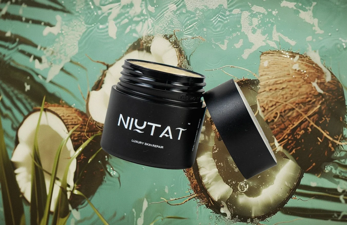
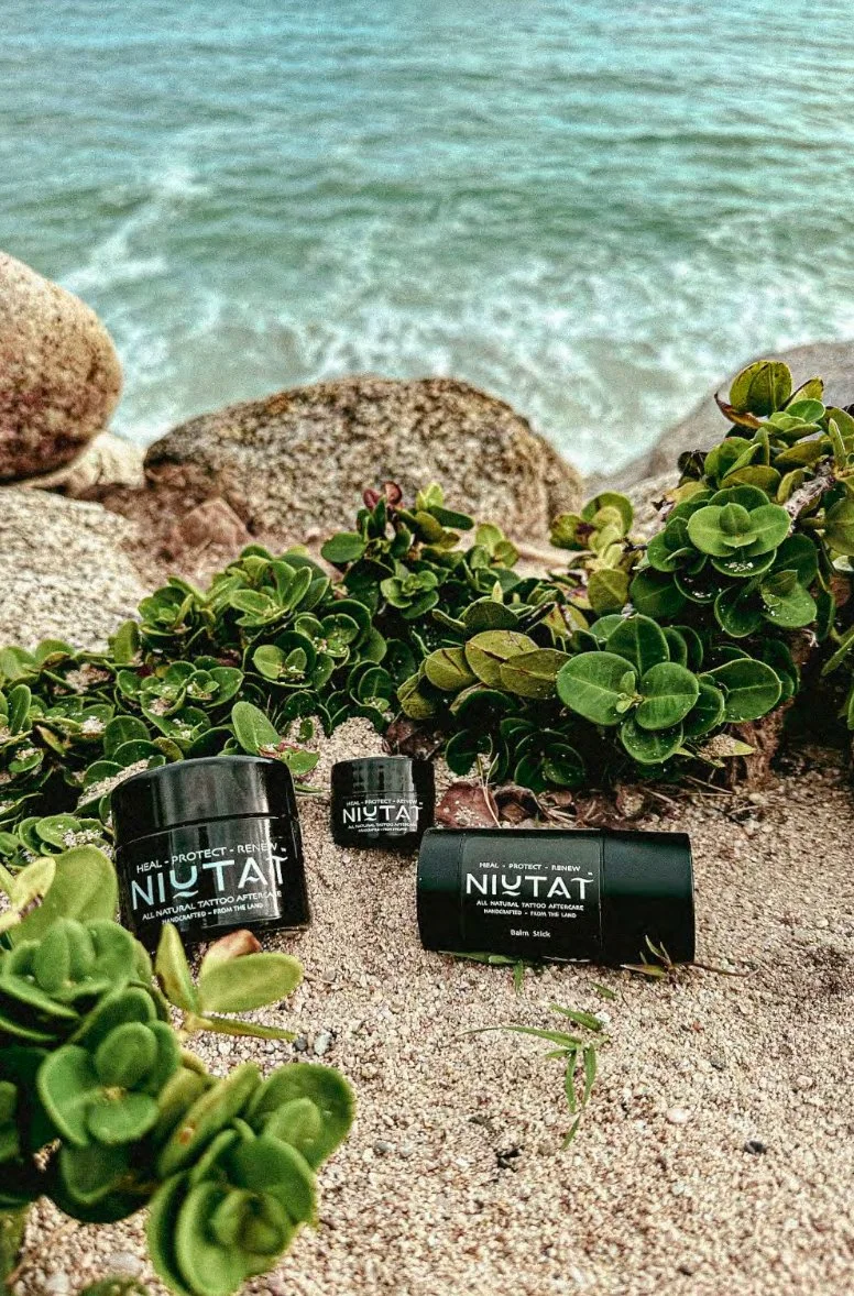
NIUTAT
BRANDING • CREATIVE DIRECTION • DESIGN
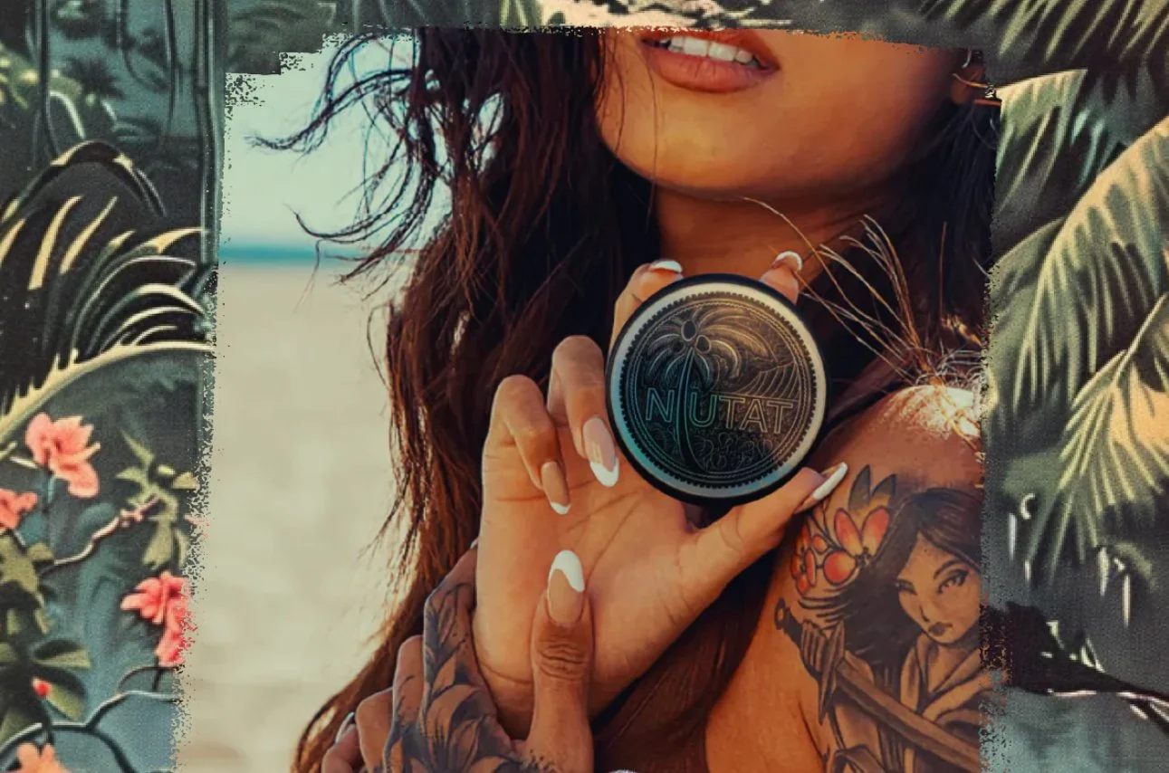
From the land. For the skin. NIUTAT is a natural tattoo pre- and post-care brand inspired by the Hawaiian spirit of NIU, the coconut palm—symbolizing nourishment, resilience, and restoration. Crafted in small batches with organic, skin-supporting ingredients and sustainable practices, the identity draws from the flora and textures of the islands to create a brand that feels grounded, protective, and quietly luxurious while helping preserve the integrity and vibrancy of tattoo art.
Rethink How You Protect Your Ink
-
NIUTAT is a tattoo pre- and post-care brand rooted in the belief that what we put on our bodies should be as thoughtful as the art we choose to wear. Inspired by the Hawaiian spirit and the meaning of “NIU” — the coconut palm — the brand reflects a deep respect for nature’s ability to restore, protect, and sustain. Crafted in small batches using a proprietary blend of organic coconut oil, beeswax, grapeseed, jojoba, emu, and hemp oils, along with NIUTAT’s exclusive essential oil blend, the formula delivers a natural approach to healing that supports both skin health and long-term tattoo vibrancy. Sustainable packaging, cruelty-free practices, and rainforest-conscious sourcing reinforce a commitment to caring not only for skin, but for the land itself.
The visual identity draws from the flora, fauna, and textures of Hawaii, expressing the balance of strength and gentleness found in nature. Coconut imagery serves as both a symbolic and functional anchor, representing nourishment, resilience, and connection to place. Typography reflects the organic integrity of the ingredients, while the imagery captures the natural beauty of the islands—creating a brand world that feels grounded, restorative, and quietly luxurious. NIUTAT was created to rethink how tattoo protection should feel: intentional, effective, and deeply connected to the source from which it comes.
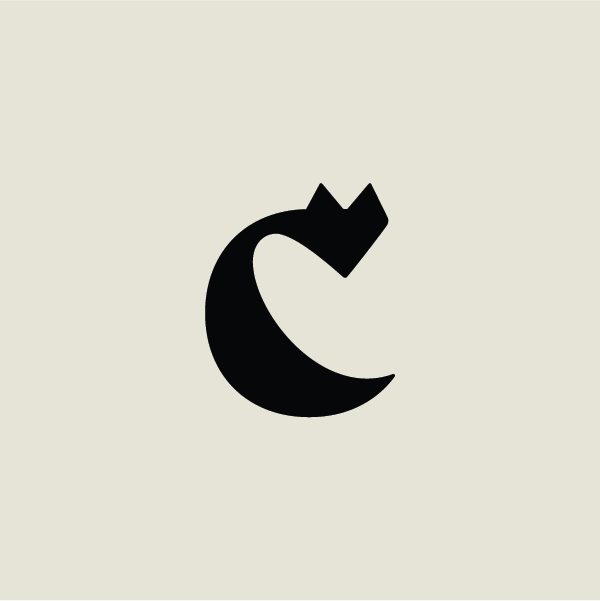
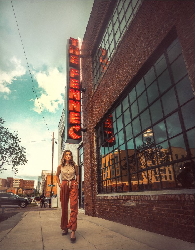
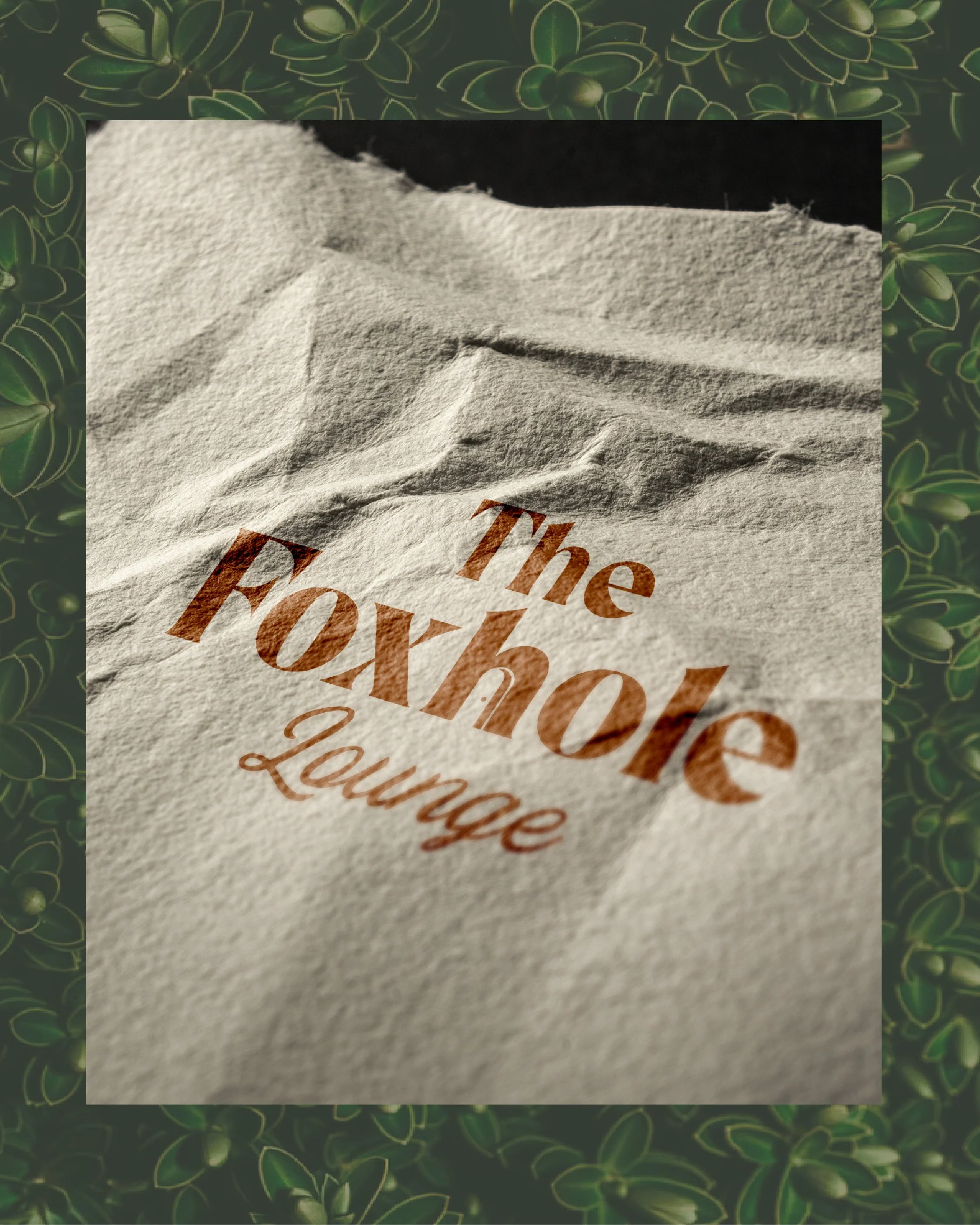
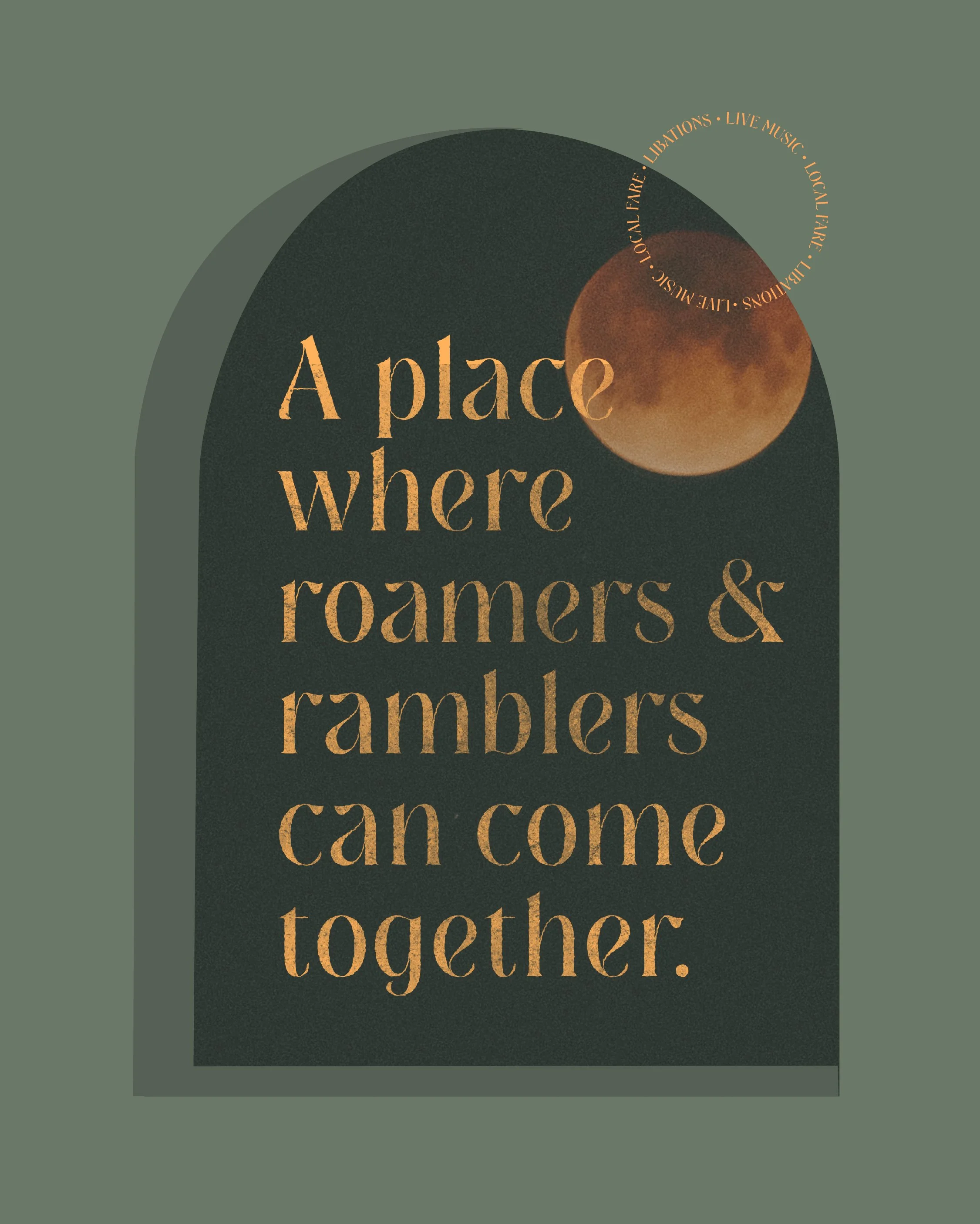
The Fennec
BRANDING • CREATIVE DIRECTION • DESIGN
The Fennec blends the heritage spirit of the Old West with the elevated energy of a modern gathering place—capturing the soul of a honky tonk through refined typography, custom illustrations, and immersive brand details. Inspired by the clever, nocturnal fennec fox and the rhythm of live music after dark, the identity creates a storied, one-of-a-kind experience designed for connection, atmosphere, and unforgettable nights.
Saloon meets social club.


-
Saloon meets social club.
The Fennec was designed to capture the spirit of the Old West saloon reimagined through the lens of a modern social club—where handcrafted drinks, live music, and shared experience create an atmosphere that feels both elevated and unrestrained. Inspired by the role historic saloons played as gathering places for wanderers and storytellers, the identity blends heritage influence with contemporary energy, creating a brand that feels welcoming by day and electric after dark. Subtle western references, layered typography, and customized illustrations provide moments of discovery throughout the experience, bringing the soul of a honky tonk into a refined, modern setting.
The story centers around the fennec fox, a clever and social desert creature known for its adaptability and lively nighttime rhythm. A symbolic companion to the wandering traveler, the fox reflects the spirit of those drawn to places where music, movement, and connection unfold organically. The logomark integrates the shape of the fox within the letter “C,” echoing desert dunes and reinforcing the narrative of exploration and gathering beneath the glow of the rising moon. Thoughtfully crafted brand elements and illustration details create a visual language that feels storied and transportive—an oasis designed for those seeking atmosphere, sound, and shared experience unlike anywhere else.
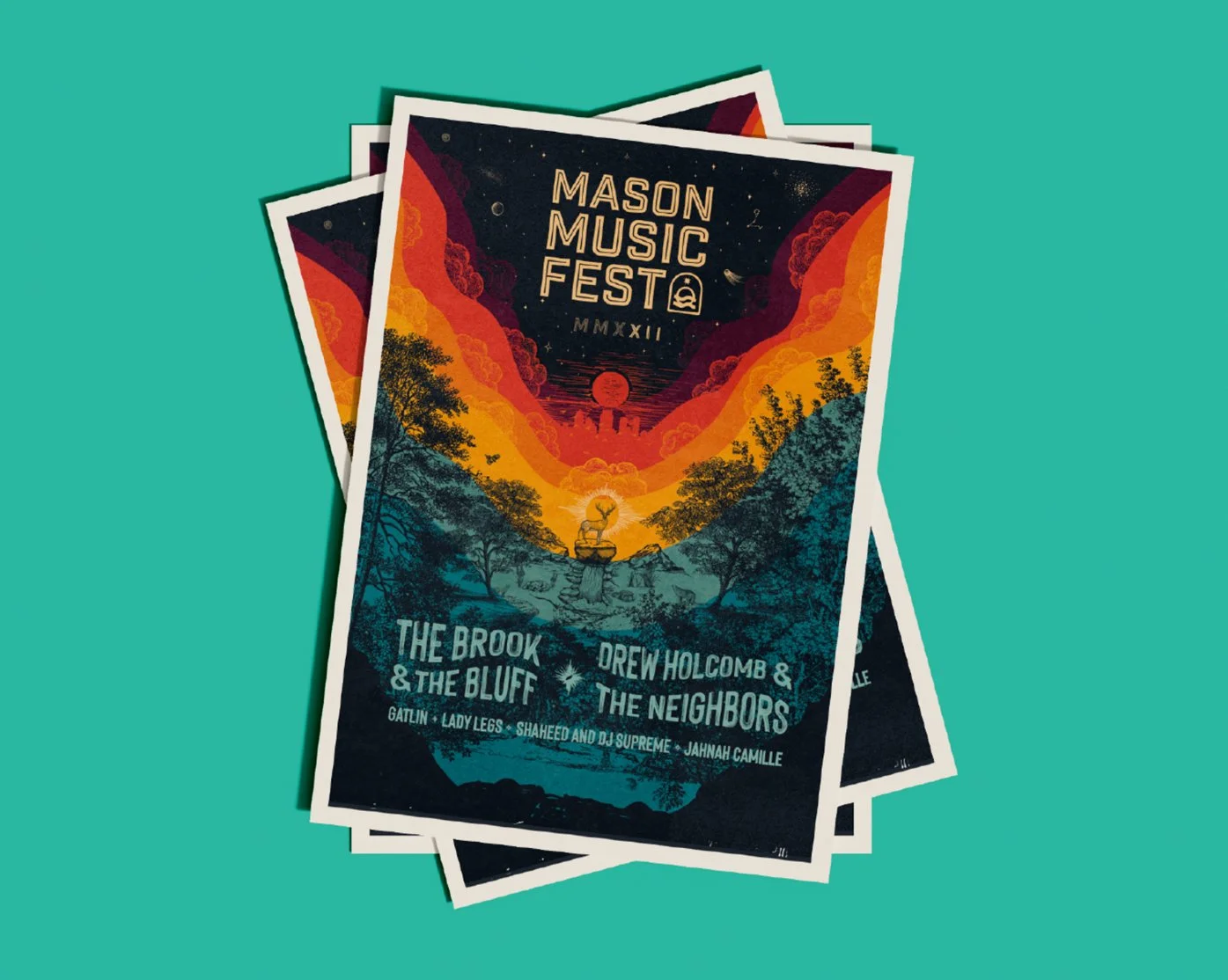
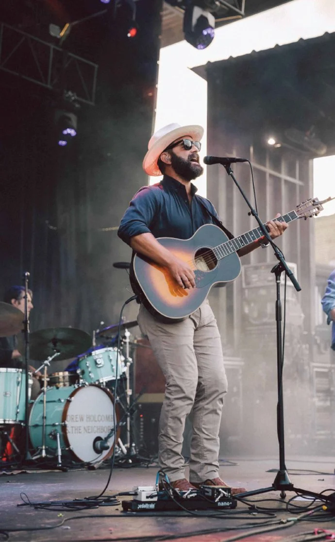
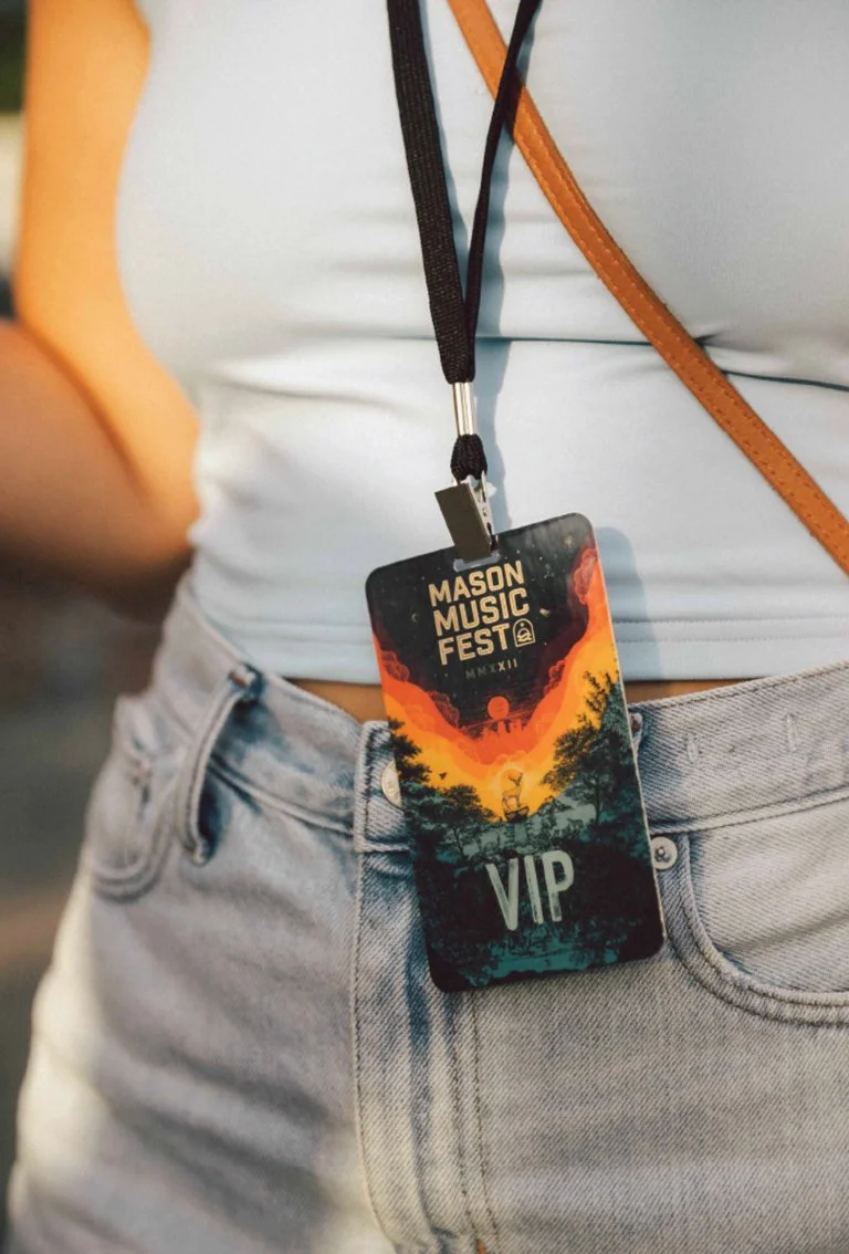
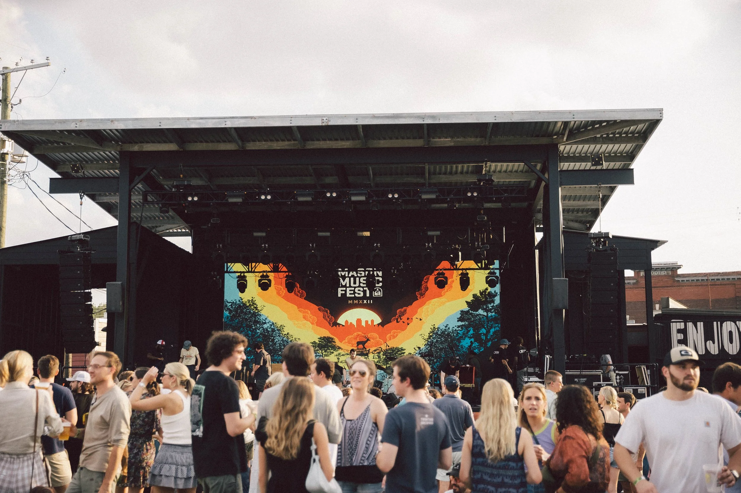
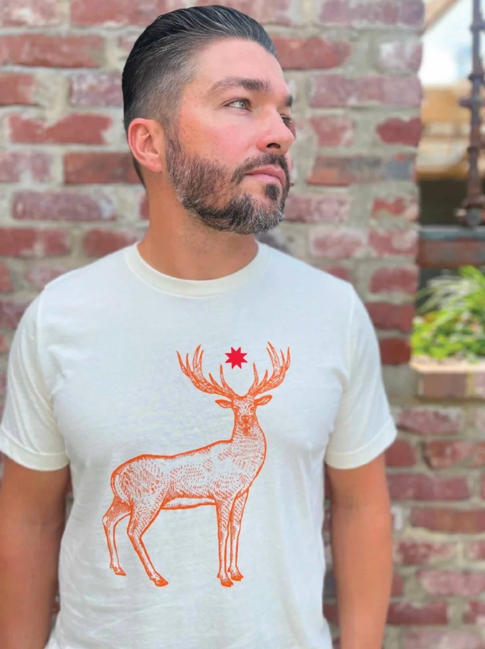
Mason Music Fest
BRANDING • CREATIVE DIRECTION • MOTION
Empowering the next generation of musicians.
Mason Music Fest is a one-night community festival designed to inspire the next generation of musicians while raising scholarship funds for the Mason Music Foundation, a nonprofit dedicated to expanding access to music education. Each year’s creative direction spans branding, motion graphics, merchandise, and event design—building an energetic, purpose-driven experience that brings the community together to support young artists and their passion for music.
-
Mason Music Fest is a one-night community festival created to inspire the next generation of musicians while directly supporting access to music education. Designed from concept to execution each year, the project includes a full creative system spanning art direction, branding, motion graphics, stage visuals, posters, credentials, merchandise, and more—each element uniquely tailored to reflect the evolving spirit of the festival. At its core, the identity represents opportunity, creativity, and connection, bringing together students, families, and music lovers in celebration of the power of learning through sound.
Founded to benefit the Mason Music Foundation, a 501(c)(3) nonprofit dedicated to expanding access to music education, the festival channels 100% of its proceeds toward scholarships for students who qualify for financial assistance. By creating an experience that feels energetic, inclusive, and purpose-driven, Mason Music Fest not only showcases talent, but helps remove barriers—ensuring more young musicians have the chance to discover their passion and develop their voice.
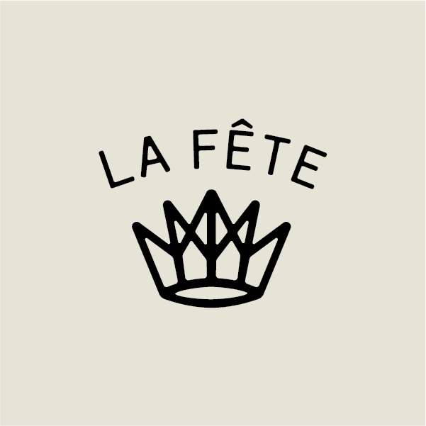
La Fête
BRANDING • CREATIVE DIRECTION • DESIGN
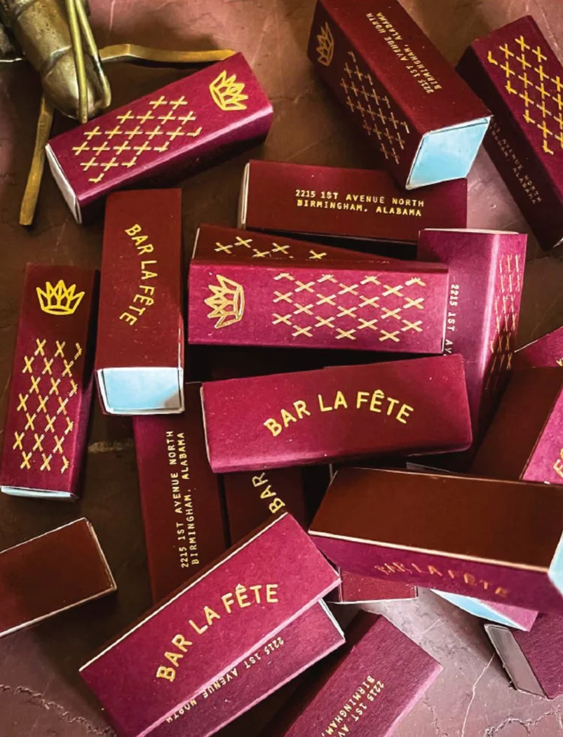
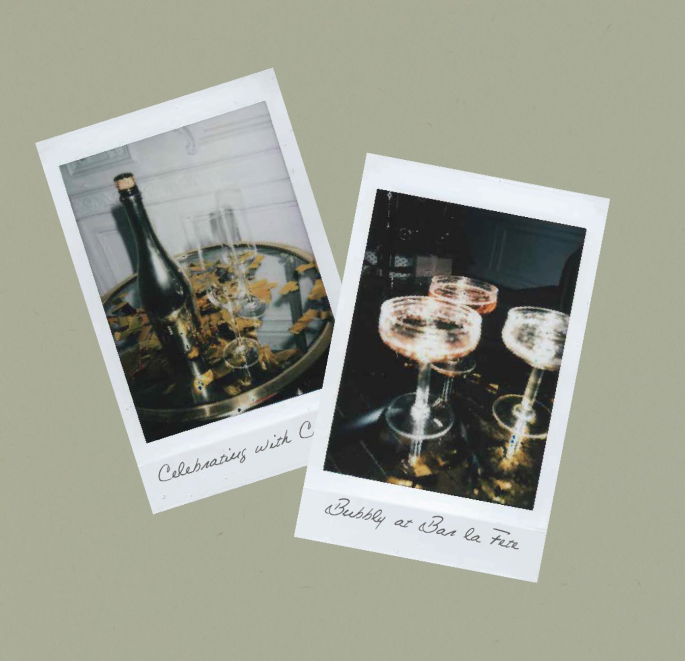
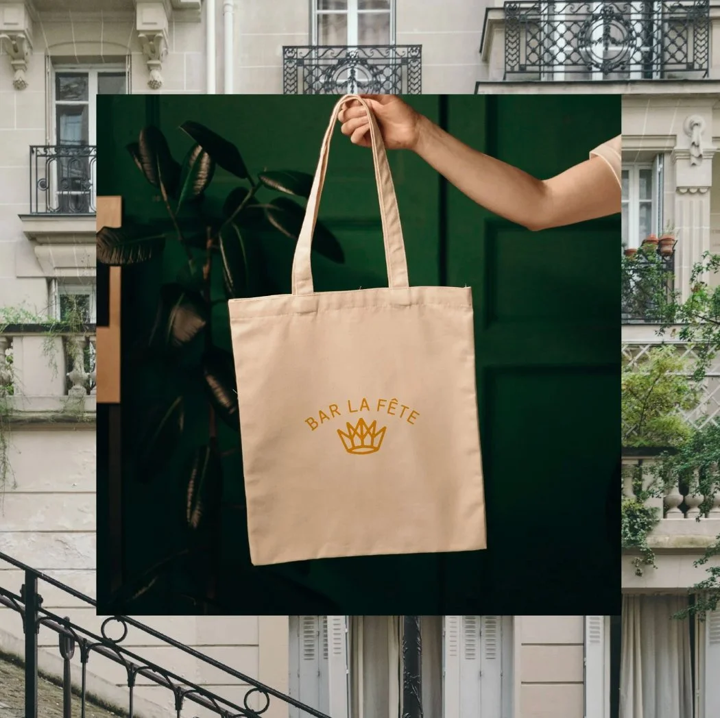
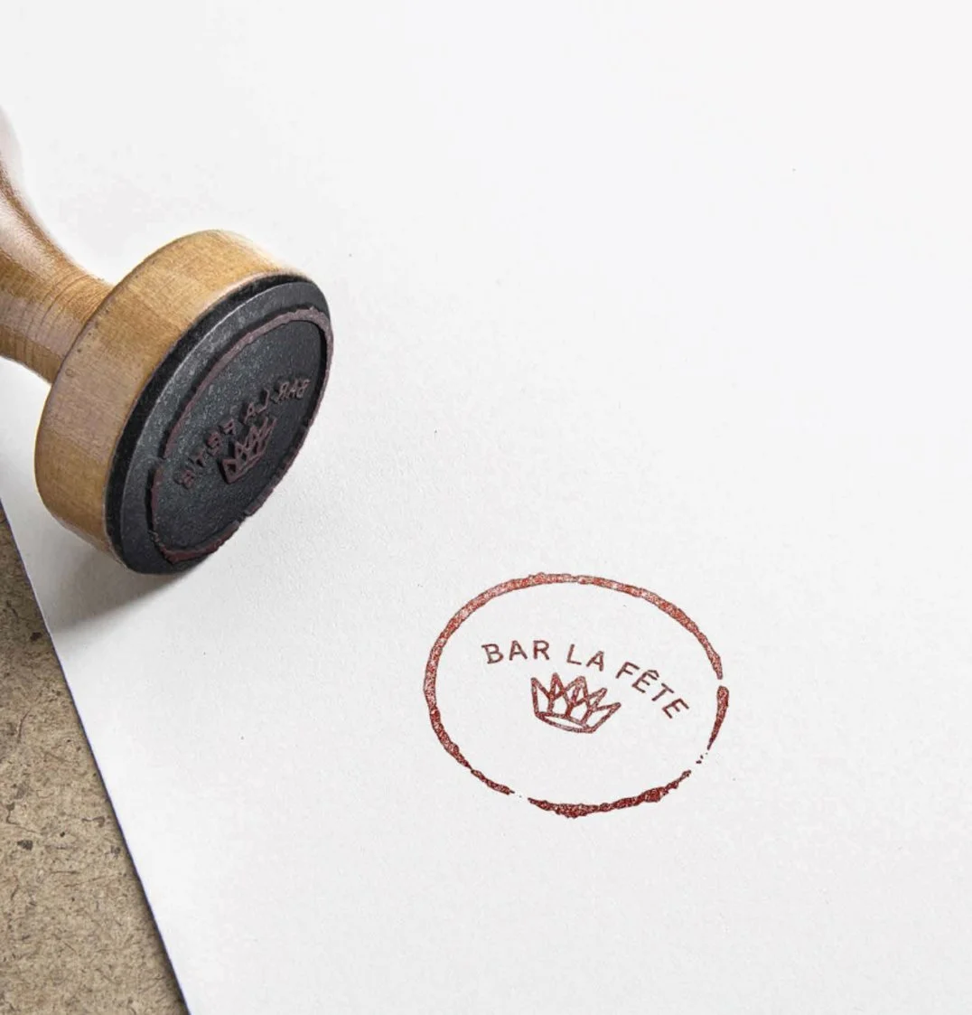
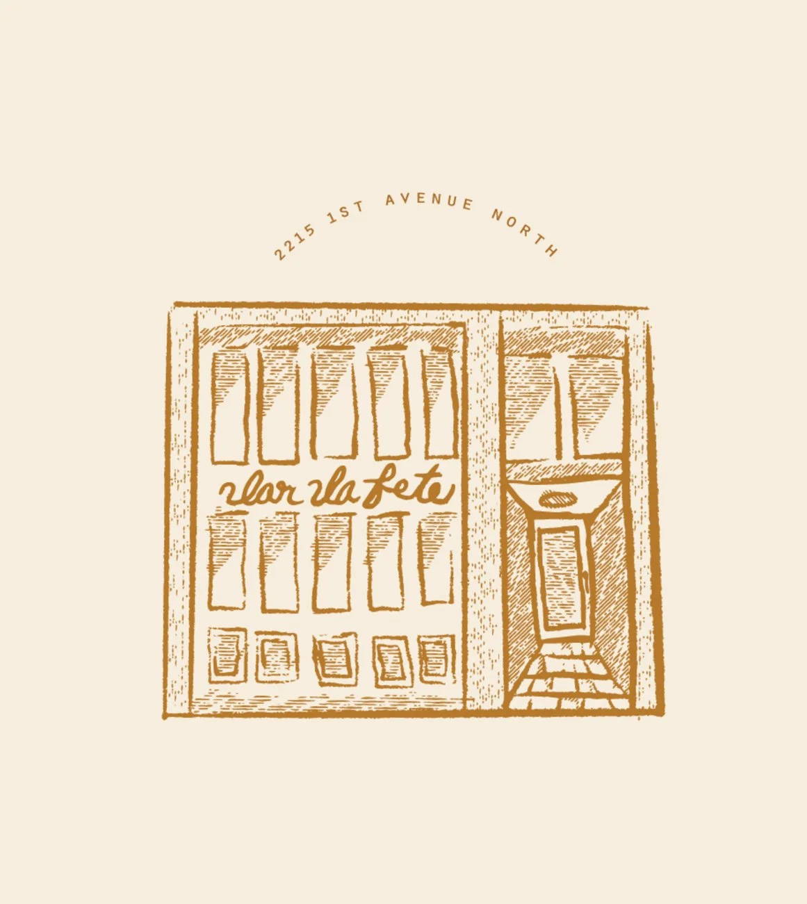
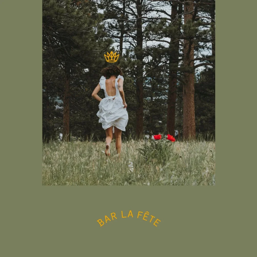
Bar La Fête is a Parisian-inspired restaurant and bar built around celebration, spontaneity, and the spirit of Why not?
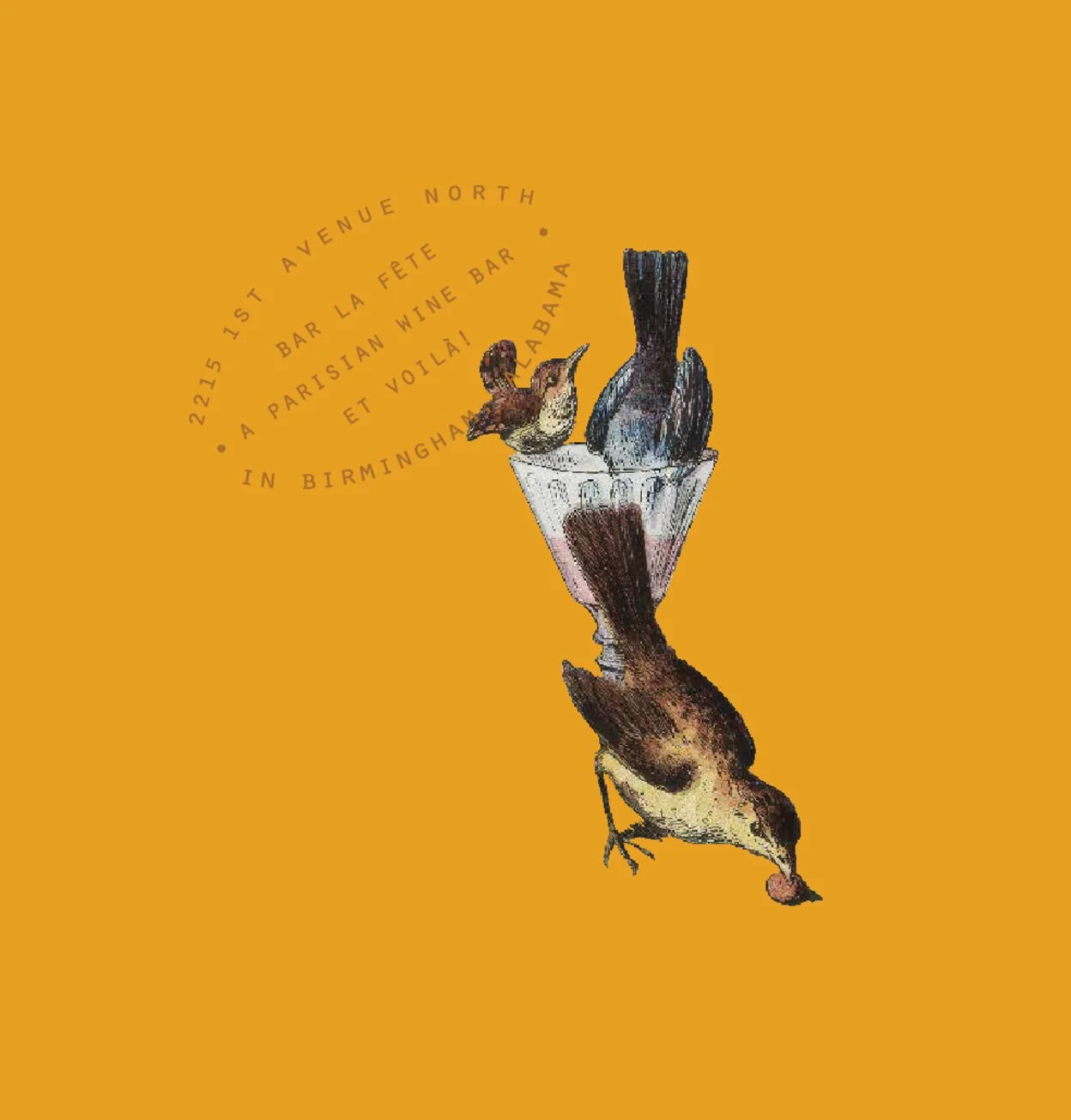
The crown mark symbolizes freedom and self-direction—an invitation to claim your own path and savor every moment—creating an identity that feels elevated, playful, and made for wherever the night leads.
-
Bar La Fête is a Parisian-inspired restaurant and bar built around the spirit of celebration, spontaneity, and possibility. Translating to “bar party” in French, the concept invites guests to embrace the joy of gathering—where delicious food, vibrant atmosphere, and a sense of occasion come together effortlessly. The identity was designed to reflect a feeling of curiosity and adventure, capturing the energy of those who believe life is best experienced with openness and a touch of indulgence. It’s a place shaped by the sentiment of Why not?—an invitation to step into the moment and see where the evening leads.
The mark centers on the crown, reimagined as a symbol of freedom rather than inheritance. Instead of something bestowed, it represents something chosen—the act of claiming one’s own path and celebrating individuality. This modern interpretation becomes an ode to the adventurer, expressing confidence, movement, and self-direction. Together, the visual language balances sophistication with playfulness, creating a brand that feels both elevated and welcoming—designed for those who see every gathering as an opportunity to celebrate the journey.
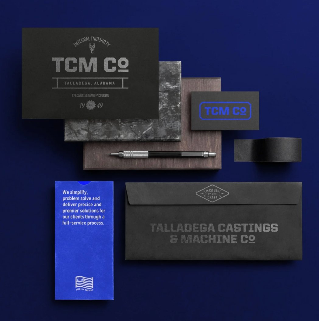
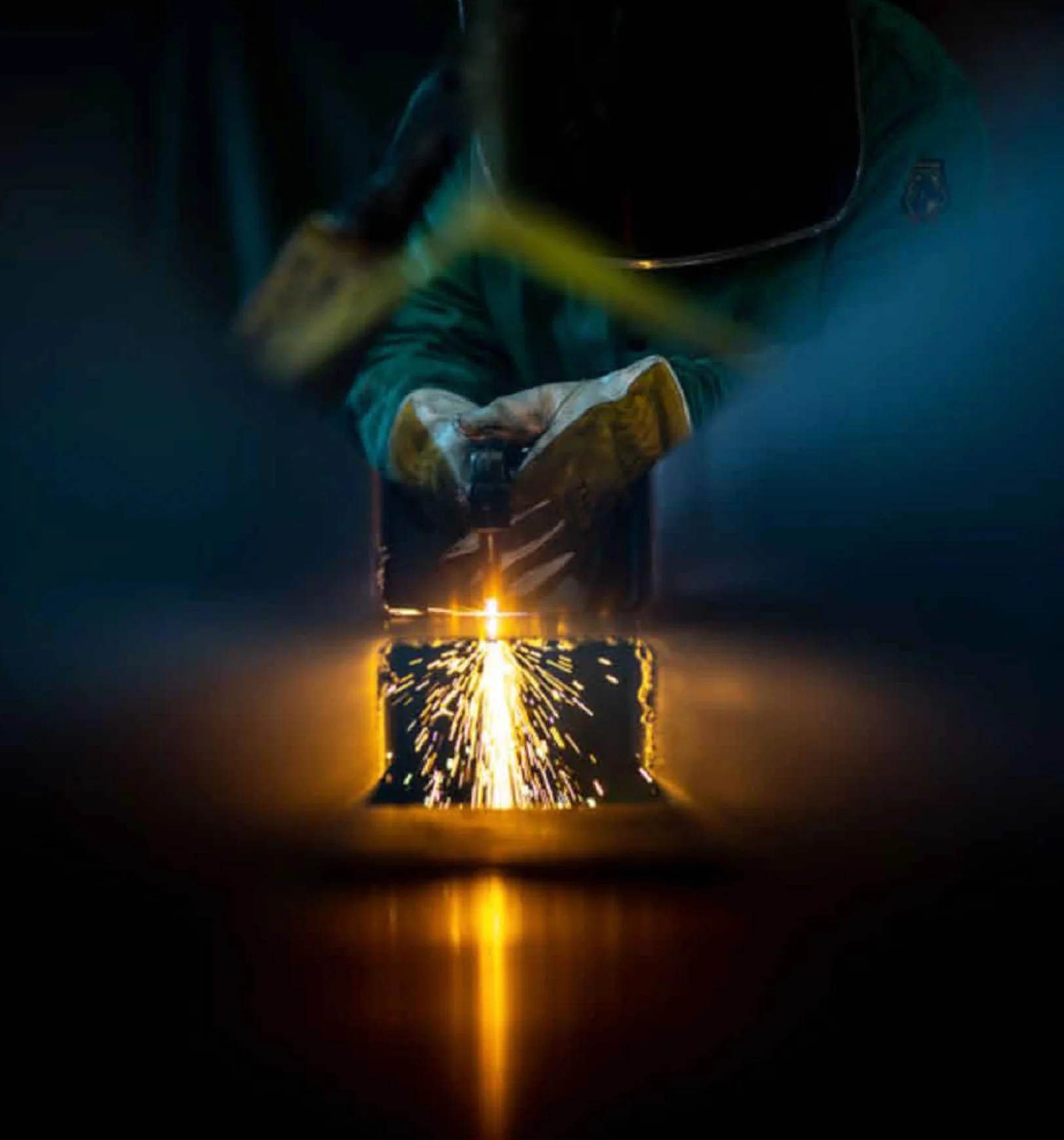
TCM Co.
REBRAND • CREATIVE DIRECTION • DESIGN
TCM Co.’s identity draws directly from the industrial environment—combining machine-inspired forms, utilitarian typography, and textures influenced by steel, sparks, and the surfaces of the shop itself. A palette rooted in tempered metal, cobalt shavings, and energy-driven yellow reinforces a brand grounded in craftsmanship, reflecting a full-service manufacturing partner committed to solving complex challenges with accuracy, accountability, and enduring skill.
Built with precision. Driven by ingenuity.
-
Integral ingenuity at the core of progress.
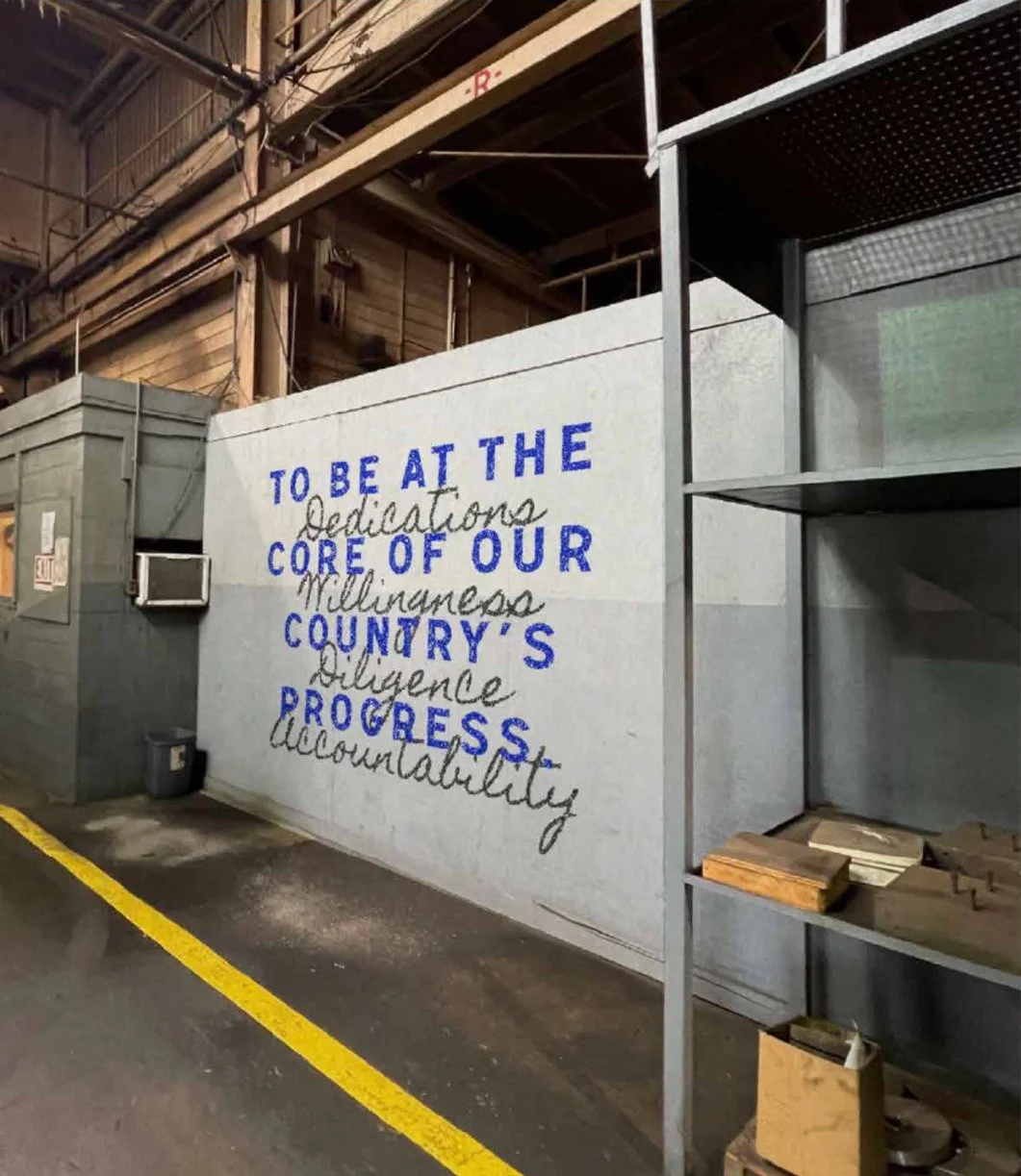
Talladega Casting and Machine Co. (TCM Co.) is a full-service manufacturing partner built on precision, problem-solving, and an unwavering commitment to craftsmanship. Guided by the belief that great work moves industries forward, the brand reflects a balance of technical expertise and hands-on ingenuity. From design collaboration to final delivery, TCM Co. approaches each project with diligence, accountability, and a willingness to find better solutions—ensuring work is completed on time, on spec, and on budget. The identity supports the company’s mission to simplify complex challenges and deliver premier results through a deeply integrated process rooted in skill and reliability.
The logo draws directly from the environment of the shop, combining an industrial typeface with visual cues that reflect the tools and materials of the trade. Elements such as the patch-inspired border, machine form, and nut-and-bolt details create a mark that feels authentic to the craft itself. The color palette is informed by the physical landscape of the workshop—cobalt blues and metallic tones drawn from steel shavings and tempered materials, complemented by a secondary yellow representing the energy of sparks in motion. Organic textures, subtle gradients, and typography selected for clarity and strength create a flexible system that feels tactile, durable, and purpose-built—capturing a brand that is as dependable as the work it produces.